BRINGING A BRIGHTER SMILE
BRINGING A BRIGHTER SMILE TO DKI'S BRAND & WEBSITE
BRINGING A BRIGHTER SMILE
BRINGING
A BRIGHTER SMILE TO DKI'S BRAND & WEBSITE
BRINGING A BRIGHTER SMILE
BRINGING
A BRIGHTER SMILE TO DKI'S BRAND & WEBSITE
BRINGING A BRIGHTER SMILE
BRINGING A BRIGHTER SMILE
TO DKI'S BRAND & WEBSITE
TO DKI'S BRAND & WEBSITE
TO DKI'S BRAND & WEBSITE
TO DKI'S BRAND & WEBSITE
TO DKI'S BRAND & WEBSITE

PROJECT OVERVIEW
PROJECT OVERVIEW
PROJECT OVERVIEW
PROJECT OVERVIEW
PROJECT OVERVIEW
PROJECT OVERVIEW
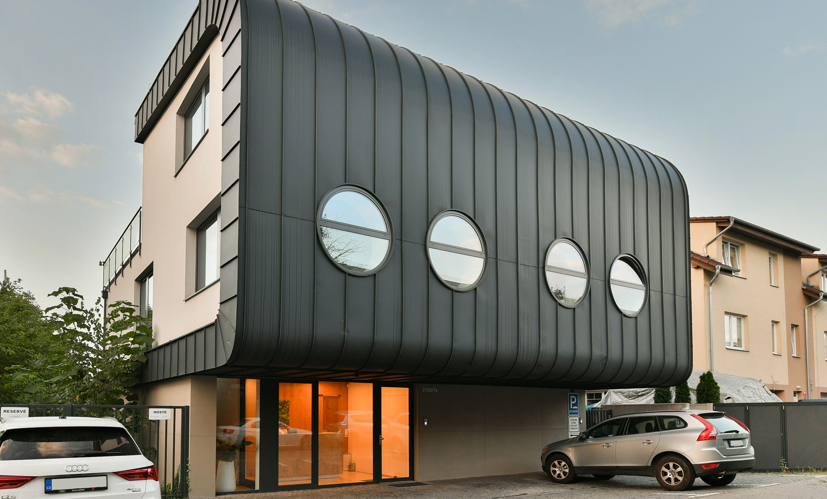
DKI, a Prague-based dental care provider, approached us to help evolve their brand into a reflection of their values: partnership, precision, and progress. With a strong presence in three clinics across the city, they needed a refreshed identity system that matched their level of care –elegant, accessible and professional. The goal was to transform how DKI communicates with the people they serve and create a visual language that mirrors the warmth of their services and the excellence of their dental practice.
DKI, a Prague-based dental care provider, approached us to help evolve their brand into a reflection of their values: partnership, precision, and progress. With a strong presence in three clinics across the city, they needed a refreshed identity system that matched their level of care –elegant, accessible and professional. The goal was to transform how DKI communicates with the people they serve and create a visual language that mirrors the warmth of their services and the excellence of their dental practice.
DKI, a Prague-based dental care provider, approached us to help evolve their brand into a reflection of their values: partnership, precision, and progress. With a strong presence in three clinics across the city, they needed a refreshed identity system that matched their level of care –elegant, accessible and professional. The goal was to transform how DKI communicates with the people they serve and create a visual language that mirrors the warmth of their services and the excellence of their dental practice.
DKI, a Prague-based dental care provider, approached us to help evolve their brand into a reflection of their values: partnership, precision, and progress. With a strong presence in three clinics across the city, they needed a refreshed identity system that matched their level of care –elegant, accessible and professional. The goal was to transform how DKI communicates with the people they serve and create a visual language that mirrors the warmth of their services and the excellence of their dental practice.
DKI, a Prague-based dental care provider, approached us to help evolve their brand into a reflection of their values: partnership, precision, and progress. With a strong presence in three clinics across the city, they needed a refreshed identity system that matched their level of care –elegant, accessible and professional. The goal was to transform how DKI communicates with the people they serve and create a visual language that mirrors the warmth of their services and the excellence of their dental practice.
DKI, a Prague-based dental care provider, approached us to help evolve their brand into a reflection of their values: partnership, precision, and progress. With a strong presence in three clinics across the city, they needed a refreshed identity system that matched their level of care –elegant, accessible and professional. The goal was to transform how DKI communicates with the people they serve and create a visual language that mirrors the warmth of their services and the excellence of their dental practice.
DKI, a Prague-based dental care provider, approached us to help evolve their brand into a reflection of their values: partnership, precision, and progress. With a strong presence in three clinics across the city, they needed a refreshed identity system that matched their level of care –elegant, accessible and professional. The goal was to transform how DKI communicates with the people they serve and create a visual language that mirrors the warmth of their services and the excellence of their dental practice.

CLIENT
CLIENT
CLIENT
CLIENT
DKI (Created for Ex Duris)
DKI (Created for Ex Duris)
DKI (Created for Ex Duris)
DKI (Created for Ex Duris)
DKI (Created for Ex Duris)
CLIENT focus
CLIENT focus
CLIENT focus
CLIENT focus
Dental health clinics
Dental health clinics
Dental health clinics
Dental health clinics
Dental health clinics
type of work
type of work
type of work
type of work
Branding & Strategy
Branding & Strategy
Branding & Strategy
Branding & Strategy
Branding & Strategy
Web Design
Web Design
Web Design
Web Design
Web Design
country & year
country & year
country & year
country & year
Czechia, 2023
Czechia, 2023
Czechia, 2023
Czechia, 2023
Czechia, 2023
The copyright for the property visualisations and photos used in this case study is owned by DKI. The copyright for the design images used in this case study is owned by Escalate Ltd.
The copyright for the property visualisations and photos used in this case study is owned by DKI. The copyright for the design images used in this case study is owned by Escalate Ltd.
The copyright for the property visualisations and photos used in this case study is owned by DKI. The copyright for the design images used in this case study is owned by Escalate Ltd.
The copyright for the property visualisations and photos used in this case study is owned by DKI. The copyright for the design images used in this case study is owned by Escalate Ltd.
The copyright for the property visualisations and photos used in this case study is owned by DKI. The copyright for the design images used in this case study is owned by Escalate Ltd.
CLIENT
DKI (Created for Ex Duris)
CLIENT focus
Dental health clinics
type of work
Branding & Strategy
Web Design
country & year
Czechia, 2023
The copyright for the property visualisations and photos used in this case study is owned by DKI. The copyright for the design images used in this case study is owned by Escalate Ltd.
the challenge
the challenge
the challenge
the challenge
the challenge
the challenge
Honoring the name & values
Honoring the name & values
Honoring the name & values
Honoring the name & values
Honoring the name & values
Honoring the name & values
Honoring the name & values
Honoring the name & values
Despite their high standards and comprehensive care, DKI’s existing identity didn’t fully express what made them unique — their relational approach, their innovation mindset, and the warmth of their patient experience. A key challenge was to preserve the original name — and with it, the initials DKI (founders Duba & Klement + Imperium), which carried personal meaning and longstanding recognition.
Despite their high standards and comprehensive care, DKI’s existing identity didn’t fully express what made them unique — their relational approach, their innovation mindset, and the warmth of their patient experience. A key challenge was to preserve the original name — and with it, the initials DKI (founders Duba & Klement + Imperium), which carried personal meaning and longstanding recognition.
Despite their high standards and comprehensive care, DKI’s existing identity didn’t fully express what made them unique — their relational approach, their innovation mindset, and the warmth of their patient experience. A key challenge was to preserve the original name — and with it, the initials DKI (founders Duba & Klement + Imperium), which carried personal meaning and longstanding recognition.
Despite their high standards and comprehensive care, DKI’s existing identity didn’t fully express what made them unique — their relational approach, their innovation mindset, and the warmth of their patient experience. A key challenge was to preserve the original name — and with it, the initials DKI (founders Duba & Klement + Imperium), which carried personal meaning and longstanding recognition.
Despite their high standards and comprehensive care, DKI’s existing identity didn’t fully express what made them unique — their relational approach, their innovation mindset, and the warmth of their patient experience. A key challenge was to preserve the original name — and with it, the initials DKI (founders Duba & Klement + Imperium), which carried personal meaning and longstanding recognition.
Despite their high standards and comprehensive care, DKI’s existing identity didn’t fully express what made them unique — their relational approach, their innovation mindset, and the warmth of their patient experience. A key challenge was to preserve the original name — and with it, the initials DKI (founders Duba & Klement + Imperium), which carried personal meaning and longstanding recognition.
Despite their high standards and comprehensive care, DKI’s existing identity didn’t fully express what made them unique — their relational approach, their innovation mindset, and the warmth of their patient experience. A key challenge was to preserve the original name — and with it, the initials DKI (founders Duba & Klement + Imperium), which carried personal meaning and longstanding recognition.


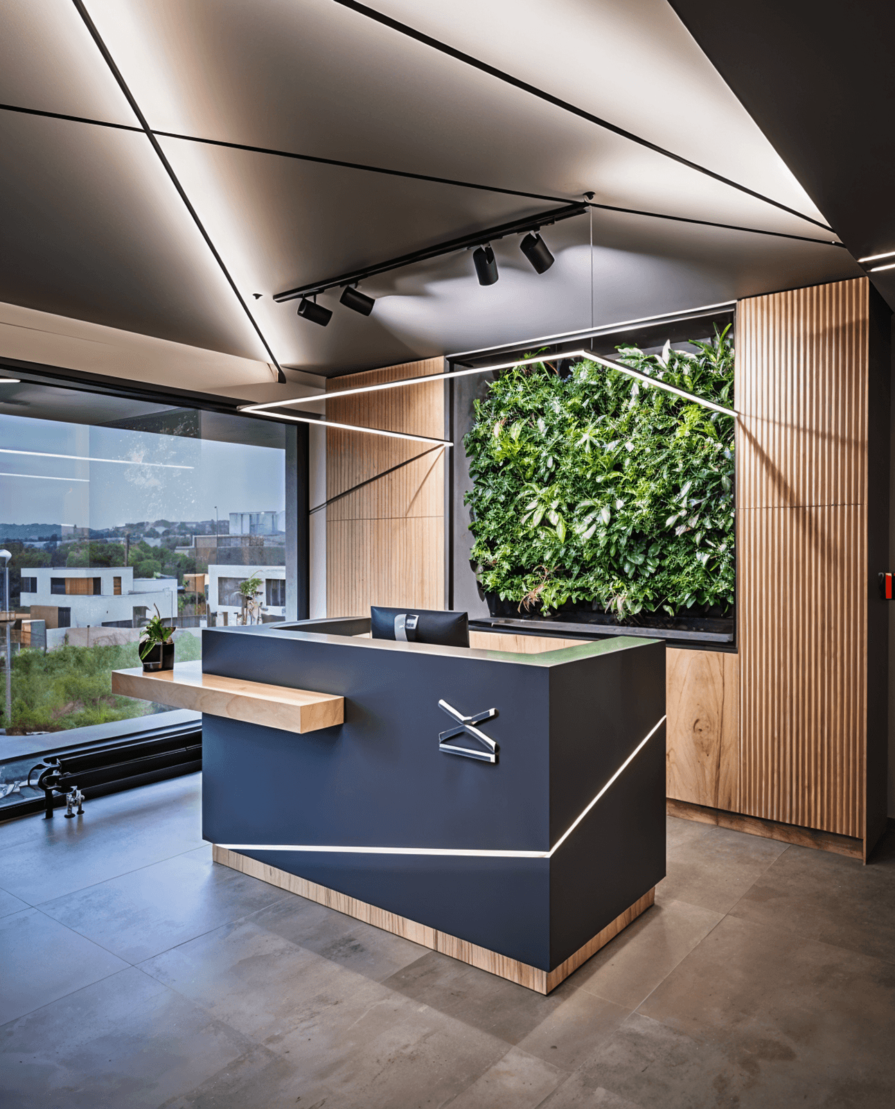
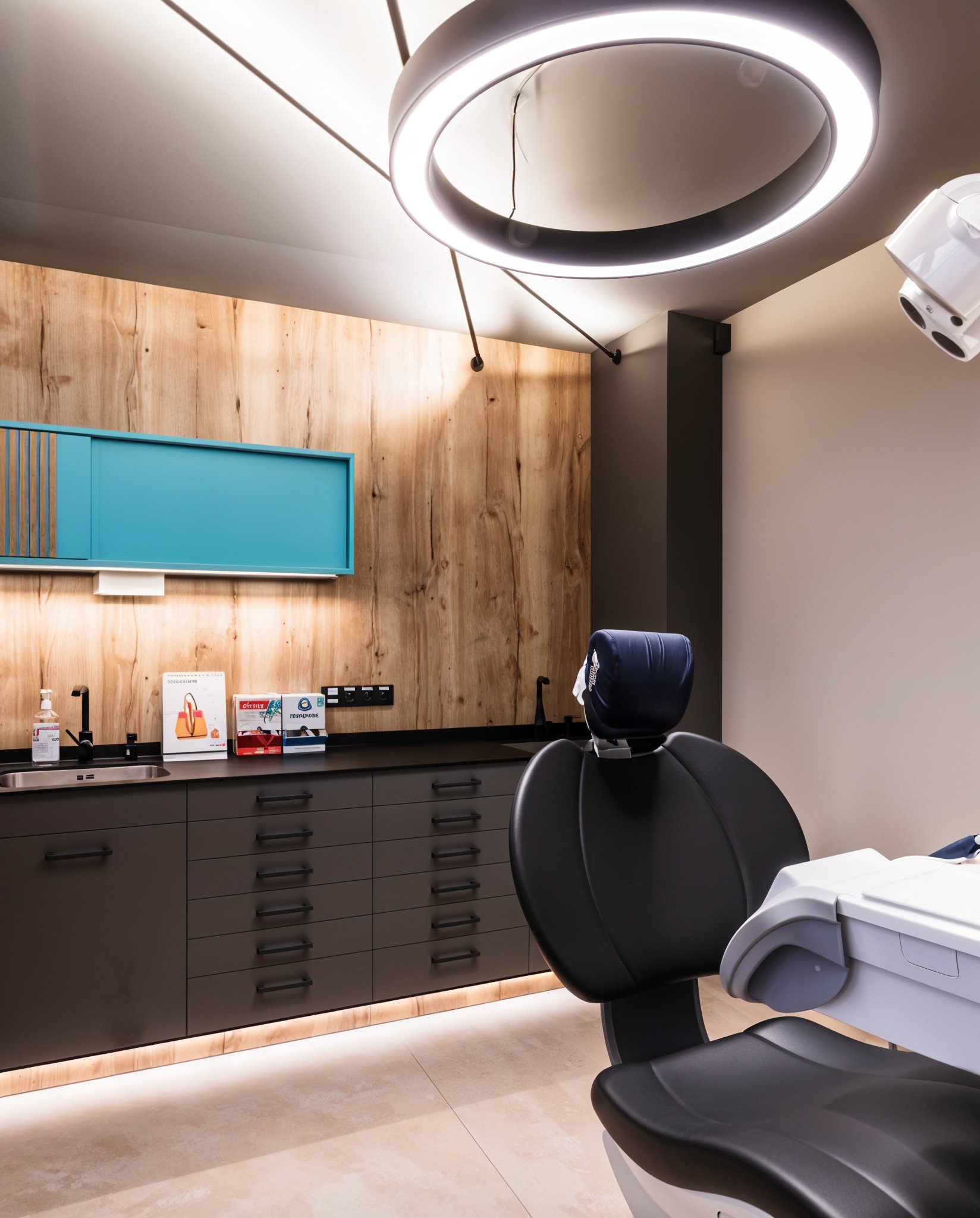
On top of that, the new brand needed to visually complement the materiality and atmosphere of their clinics, which already featured refined black surfaces, calming turquoise accents, and the warmth of light orange wood. The brand had to evolve — but it also had to belong.
On top of that, the new brand needed to visually complement the materiality and atmosphere of their clinics, which already featured refined black surfaces, calming turquoise accents, and the warmth of light orange wood. The brand had to evolve — but it also had to belong.
On top of that, the new brand needed to visually complement the materiality and atmosphere of their clinics, which already featured refined black surfaces, calming turquoise accents, and the warmth of light orange wood. The brand had to evolve — but it also had to belong.
On top of that, the new brand needed to visually complement the materiality and atmosphere of their clinics, which already featured refined black surfaces, calming turquoise accents, and the warmth of light orange wood. The brand had to evolve — but it also had to belong.
On top of that, the new brand needed to visually complement the materiality and atmosphere of their clinics, which already featured refined black surfaces, calming turquoise accents, and the warmth of light orange wood. The brand had to evolve — but it also had to belong.
On top of that, the new brand needed to visually complement the materiality and atmosphere of their clinics, which already featured refined black surfaces, calming turquoise accents, and the warmth of light orange wood. The brand had to evolve — but it also had to belong.
On top of that, the new brand needed to visually complement the materiality and atmosphere of their clinics, which already featured refined black surfaces, calming turquoise accents, and the warmth of light orange wood. The brand had to evolve — but it also had to belong.
the solution
the solution
the solution
the solution
the solution
the solution
A brand that speaks of trust
A brand that speaks of trust
A brand that speaks of trust
A brand that speaks of trust
A brand that speaks of trust
A brand that speaks of trust
A brand that speaks of trust
A brand that speaks of trust
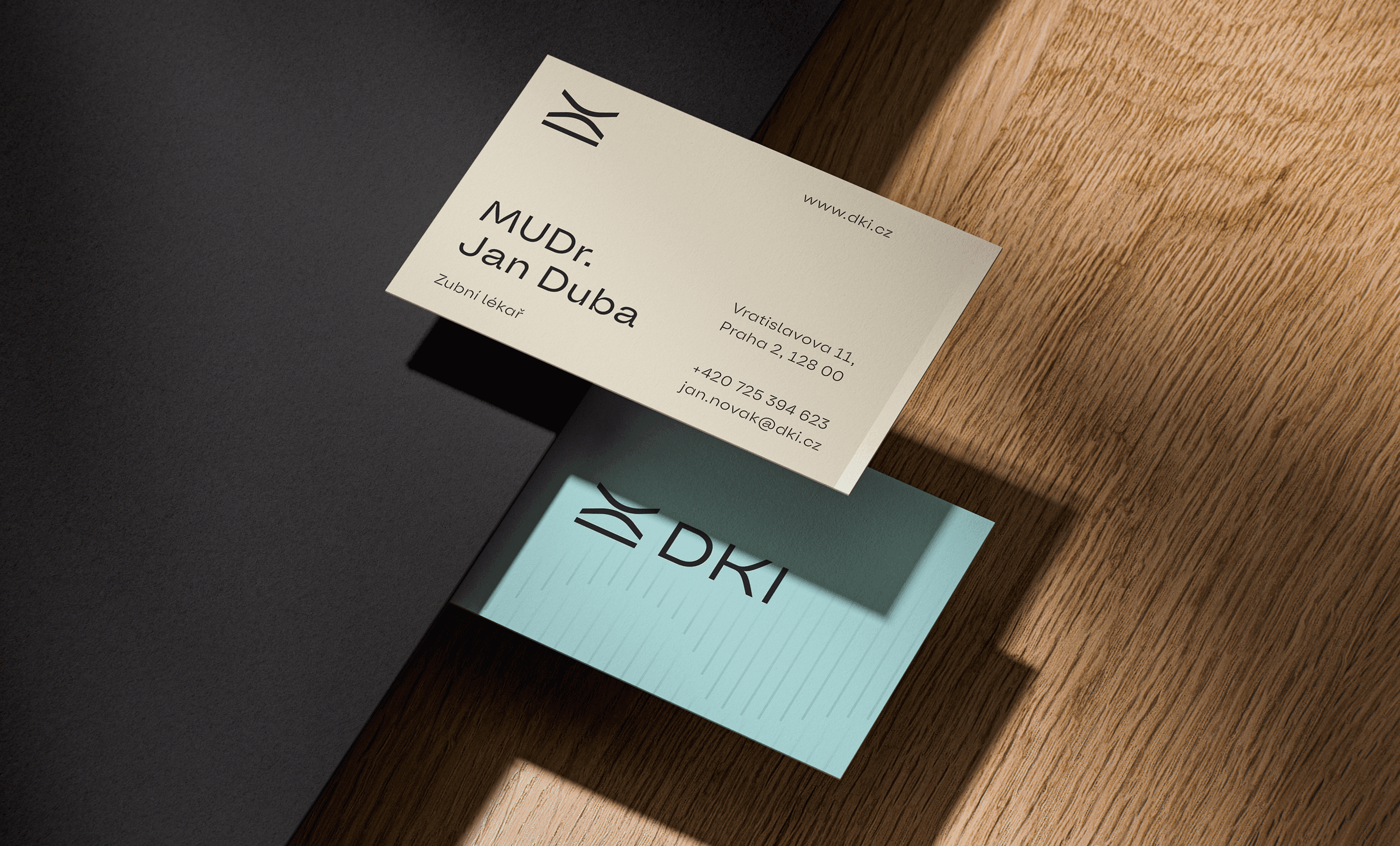
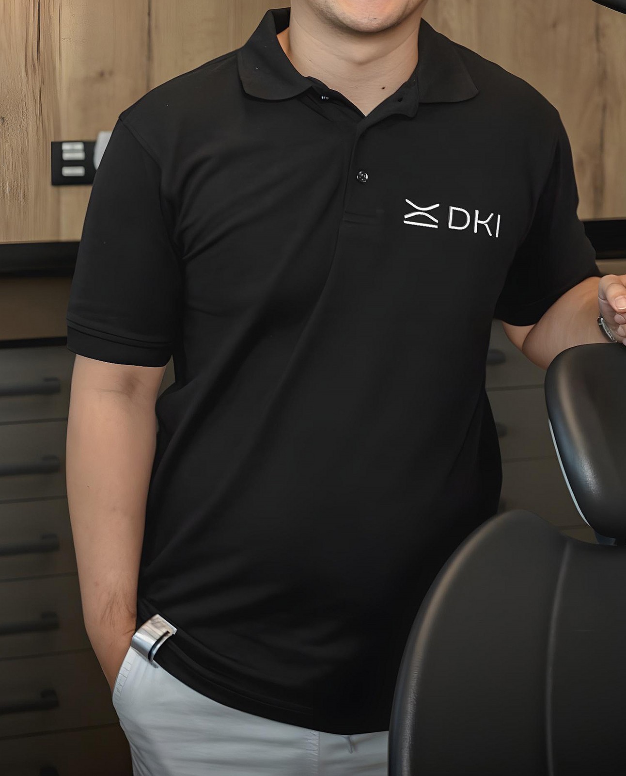
We crafted a logo built from the initials D, K and I — expressed through three softly ascending lines that evoke partnership, support, and oral care in a minimal, abstract form. The new brand identity was designed as a flexible yet coherent system. We extended it across elegant printed materials, branded dental kits, and clinic merchandise, always balancing premium detail with patient-friendly clarity.
We crafted a logo built from the initials D, K and I — expressed through three softly ascending lines that evoke partnership, support, and oral care in a minimal, abstract form. The new brand identity was designed as a flexible yet coherent system. We extended it across elegant printed materials, branded dental kits, and clinic merchandise, always balancing premium detail with patient-friendly clarity.
We crafted a logo built from the initials D, K and I — expressed through three softly ascending lines that evoke partnership, support, and oral care in a minimal, abstract form. The new brand identity was designed as a flexible yet coherent system. We extended it across elegant printed materials, branded dental kits, and clinic merchandise, always balancing premium detail with patient-friendly clarity.
We crafted a logo built from the initials D, K and I — expressed through three softly ascending lines that evoke partnership, support, and oral care in a minimal, abstract form. The new brand identity was designed as a flexible yet coherent system. We extended it across elegant printed materials, branded dental kits, and clinic merchandise, always balancing premium detail with patient-friendly clarity.
We crafted a logo built from the initials D, K and I — expressed through three softly ascending lines that evoke partnership, support, and oral care in a minimal, abstract form. The new brand identity was designed as a flexible yet coherent system. We extended it across elegant printed materials, branded dental kits, and clinic merchandise, always balancing premium detail with patient-friendly clarity.
We crafted a logo built from the initials D, K and I — expressed through three softly ascending lines that evoke partnership, support, and oral care in a minimal, abstract form. The new brand identity was designed as a flexible yet coherent system. We extended it across elegant printed materials, branded dental kits, and clinic merchandise, always balancing premium detail with patient-friendly clarity.
We crafted a logo built from the initials D, K and I — expressed through three softly ascending lines that evoke partnership, support, and oral care in a minimal, abstract form. The new brand identity was designed as a flexible yet coherent system. We extended it across elegant printed materials, branded dental kits, and clinic merchandise, always balancing premium detail with patient-friendly clarity.


The visual language intentionally harmonizes with DKI’s interiors: premium black and neutral tones ground the brand, while a refreshed palette of turquoise and soft orange brings a sense of calm, warmth, and optimism.
The visual language intentionally harmonizes with DKI’s interiors: premium black and neutral tones ground the brand, while a refreshed palette of turquoise and soft orange brings a sense of calm, warmth, and optimism.
The visual language intentionally harmonizes with DKI’s interiors: premium black and neutral tones ground the brand, while a refreshed palette of turquoise and soft orange brings a sense of calm, warmth, and optimism.
The visual language intentionally harmonizes with DKI’s interiors: premium black and neutral tones ground the brand, while a refreshed palette of turquoise and soft orange brings a sense of calm, warmth, and optimism.
The visual language intentionally harmonizes with DKI’s interiors: premium black and neutral tones ground the brand, while a refreshed palette of turquoise and soft orange brings a sense of calm, warmth, and optimism.
The visual language intentionally harmonizes with DKI’s interiors: premium black and neutral tones ground the brand, while a refreshed palette of turquoise and soft orange brings a sense of calm, warmth, and optimism.
The visual language intentionally harmonizes with DKI’s interiors: premium black and neutral tones ground the brand, while a refreshed palette of turquoise and soft orange brings a sense of calm, warmth, and optimism.


A new website tied it all together — modern, clear, and intuitive, just like the DKI experience.
A new website tied it all together — modern, clear, and intuitive, just like the DKI experience.
A new website tied it all together — modern, clear, and intuitive, just like the DKI experience.
A new website tied it all together — modern, clear, and intuitive, just like the DKI experience.
A new website tied it all together — modern, clear, and intuitive, just like the DKI experience.
A new website tied it all together — modern, clear, and intuitive, just like the DKI experience.
A new website tied it all together — modern, clear, and intuitive, just like the DKI experience.


THE result
THE result
THE result
THE result
THE result
THE result
A brand patients can feel
A brand patients can feel
A brand patients can feel
A brand patients can feel
A brand patients can feel
A brand patients can feel
A brand patients can feel
A brand patients can feel
The rebranding gave DKI a distinct voice in a saturated market — one that patients instantly recognise and trust. Internally, the design aligned the team around shared values of innovation and care. With a brand experience that now lives across print, digital, and physical spaces, DKI can continue building relationships that go far beyond the dental chair.
The rebranding gave DKI a distinct voice in a saturated market — one that patients instantly recognise and trust. Internally, the design aligned the team around shared values of innovation and care. With a brand experience that now lives across print, digital, and physical spaces, DKI can continue building relationships that go far beyond the dental chair.
The rebranding gave DKI a distinct voice in a saturated market — one that patients instantly recognise and trust. Internally, the design aligned the team around shared values of innovation and care. With a brand experience that now lives across print, digital, and physical spaces, DKI can continue building relationships that go far beyond the dental chair.
The rebranding gave DKI a distinct voice in a saturated market — one that patients instantly recognise and trust. Internally, the design aligned the team around shared values of innovation and care. With a brand experience that now lives across print, digital, and physical spaces, DKI can continue building relationships that go far beyond the dental chair.
The rebranding gave DKI a distinct voice in a saturated market — one that patients instantly recognise and trust. Internally, the design aligned the team around shared values of innovation and care. With a brand experience that now lives across print, digital, and physical spaces, DKI can continue building relationships that go far beyond the dental chair.
The rebranding gave DKI a distinct voice in a saturated market — one that patients instantly recognise and trust. Internally, the design aligned the team around shared values of innovation and care. With a brand experience that now lives across print, digital, and physical spaces, DKI can continue building relationships that go far beyond the dental chair.
The rebranding gave DKI a distinct voice in a saturated market — one that patients instantly recognise and trust. Internally, the design aligned the team around shared values of innovation and care. With a brand experience that now lives across print, digital, and physical spaces, DKI can continue building relationships that go far beyond the dental chair.
The website Brazen® created for me exceeded my expectations in every way. It's beautiful, functional, and exactly what I was looking for. I couldn't be happier with the results.
"We felt like we were in a safe pair of hands and could trust that the end product would be cohesive. The team was very passionate about this new opportunity. The communication was swift. They made the whole process very easy for us and demonstrated solid knowledgeand skills on top of creative flair."
"We felt like we were in a safe pair of hands and could trust that the end product would be cohesive. The team was very passionate about this new opportunity. The communication was swift. They made the whole process very easy for us and demonstrated solid knowledgeand skills on top of creative flair."
"We felt like we were in a safe pair of hands and could trust that the end product would be cohesive. The team was very passionate about this new opportunity. The communication was swift. They made the whole process very easy for us and demonstrated solid knowledgeand skills on top of creative flair."


Benjamin Anderson
Anna Szczurowska
Anna Szczurowska
Anna Szczurowska
FOUNDER & CEO
PRODUCT MANAGER, THE BASE FOL GMBH
PRODUCT MANAGER, THE BASE FOL GMBH
PRODUCT MANAGER, THE BASE FOL GMBH